Pretty Rot: When Horror Learned to Make Destruction Look This Good
Open any horror-adjacent corner of the internet right now and you'll find something that would have confused the genre's founding generation: beauty. Not in spite of the darkness — because of it. Carefully composed shots of decay. Color-graded gore that looks like oil painting. Apocalyptic landscapes so visually immaculate that your first instinct is to screenshot them. Rot, ruin, and horror dressed up in the most enviable aesthetic clothes you've ever seen.
Something shifted. And it's worth figuring out exactly what.
The Upgrade Nobody Planned
For most of its history, horror operated on a different aesthetic contract. The ugliness was the point. The cheap-looking rubber monster, the practical effects that weren't quite convincing, the grainy texture of a low-budget production — these weren't failures. They were part of the grammar. Horror was supposed to look wrong because what it was depicting was wrong.
Then cinematography happened to it.
Films like Suspiria (the Guadagnino version), Annihilation, The Neon Demon, and Midsommar arrived with production design so gorgeous it created a genuine problem: you wanted to live inside these films even as they were actively horrifying you. The color palettes were museum-worthy. The framing was architectural. The destruction — when it came — was choreographed like a ballet and lit like a Caravaggio painting.
This wasn't accidental. Directors were making a deliberate choice to use beauty as a delivery mechanism for horror, betting that the contrast would make the disturbing content hit harder. And they were right. But something else happened too, something they maybe didn't fully anticipate: the beauty became the thing people talked about. The horror became the vehicle for the aesthetic.
Decay as Design Language
Let's talk about the specific visual vocabulary that's emerged from this shift, because it's worth naming.
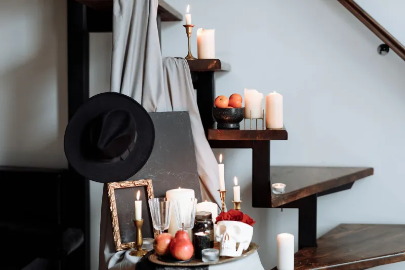
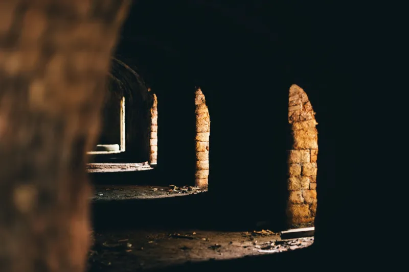
Aesthetic decay — the visual representation of rot, ruin, and organic destruction — has become one of the dominant design languages in contemporary horror and dark media. Flowers growing through skulls. Fungal blooms in colors that have no business being that saturated. Crumbling architecture that looks like it was styled by a production designer working from a Pinterest board. Old photographs with water damage that somehow looks intentional. Rust that photographs like velvet.
This stuff is everywhere. It's in horror film marketing materials, in the visual identity of dark fiction publishers, in the aesthetic vocabulary of every horror-adjacent Instagram account and TikTok creator who's figured out that "beautiful decay" gets engagement in a way that straightforwardly ugly horror doesn't.
The interesting question is why it works — and what it's doing to the content it packages.
The Envy Problem
Here's where things get genuinely strange. When horrific content gets aestheticized to a high enough degree, it stops triggering repulsion and starts triggering something closer to desire. You don't recoil from the image. You want it.
This is the envy problem, and it's real. Scroll through the right accounts and you'll find apocalyptic imagery that looks more aspirational than frightening. Ruined cities with golden-hour lighting. Overgrown structures that look like luxury retreats. Death imagery that's been color-graded into something you'd frame on a wall.
The content is dark. The response it generates is covetous.
There's a direct line from this to the broader aestheticization of destruction that's happened across social media — the way certain natural disasters get documented with an eye toward their photographic beauty, the way abandoned places became a whole genre of aspirational photography, the way "dark academia" and related aesthetics package morbidity as a lifestyle category. The horror genre didn't invent this, but it's one of the cleaner places to observe it.
When we make destruction beautiful, we change our relationship to it. It stops being something to fear and starts being something to curate.
The Films and Creators Doing It Best Right Now
If you want to see this aesthetic at its most developed, here's where to look:
Ari Aster's filmography remains the gold standard for making domestic horror cinematographically gorgeous. The production design in Hereditary and Beau Is Afraid treats horror spaces like art installations. You'd hang frames from either film in a gallery without context and they'd work.
Brandon Cronenberg — son of, and very much his own thing — has developed a visual language in Possessor and Infinity Pool that makes body horror look like haute couture. The violence is impeccably designed. The decay is aspirational in a way that's deeply unsettling precisely because it shouldn't be.
The recent wave of folk horror — The Wicker Man descendants, films like The Witch and Men — uses natural environments the way landscape painters do, making the pastoral beautiful and threatening simultaneously. The rot here is organic, literally: flowers, forests, bodies returning to the earth in ways that photograph magnificently.
In the literary space, small press horror publishers like Tor Nightfire and various indie imprints have invested heavily in cover design that treats dark content as a design challenge rather than a marketing afterthought. The results are books that look extraordinary on a shelf — which, of course, is the point.
When the Darkness Goes Instagram-Ready
The logical endpoint of all this is the question of what happens when the most disturbing content becomes the most shareable content — not despite its darkness but because of how beautifully that darkness has been packaged.
We're already living in that moment. Horror aesthetics have colonized mainstream visual culture in a way that would have been unthinkable twenty years ago. The color palette of prestige horror — deep teals, saturated greens, the specific warm-red of golden-hour gore — shows up in fashion campaigns, interior design content, lifestyle branding. Decay is a vibe. Rot is aspirational. The beautiful terrible thing is the thing everyone wants to be near.
This isn't necessarily bad. Art has always found beauty in darkness — that's basically the definition of the sublime, and people have been chasing it since Burke wrote about it in 1757. But the specific contemporary version of this, filtered through social media and the attention economy, adds something new: the incentive to make darkness beautiful isn't just aesthetic. It's algorithmic. Beautiful darkness performs. Ugly darkness doesn't trend.
The genre is responding to those incentives, and the results are genuinely stunning. Whether they're still genuinely horrifying is a question worth sitting with.
Because the most successful horror doesn't want you to covet it. It wants you to lose sleep over it. And somewhere in the gap between those two responses is where the aesthetics of decay get interesting — and maybe a little dangerous.